We are the plain speaking, hardworking creative agency for companies with big ambitions


Our clients love what we do!
We create bold campaigns and outstanding marketing assets with urgency, expertise and a no-fuss attitude
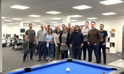
Our in-house team of creative, digital and media experts are passionate about our clients and what they do
-
0
Multi-skilled team members -
0
Years making a difference -
0
Completed Projects